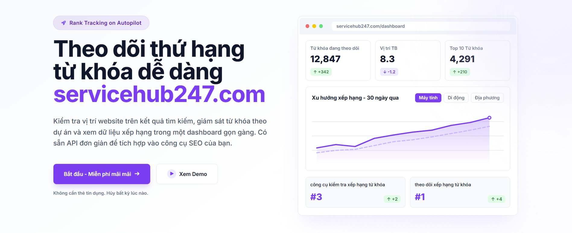
The Visibility chart on each project card looks simple - one line over time. But it's the single most synthesized signal for that project's SEO health. This guide explains what it measures, why the Y-axis is inverted, and how to read the four most common shapes.
What Visibility actually measures
The system computes it like this: for each day in the selected timeframe, take every crawl performed that day across all keywords in the project, then compute the average position. That gives you one data point per day. Connect the dots - that's Visibility.
Note: keywords with no ranking that day are excluded from that day's average, not counted as 0 or 100. So the line isn't distorted by uncrawled keywords.
Inverted Y-axis - and why it makes sense
Position 1 is at the top and position 100 is at the bottom. Why? Because in SEO, "good" means a small number. With a normal axis, the line would go down when rankings get better - counterintuitive. Inverting fixes it: a line going up always means better.
Quick rule: line up = average position improving. Line down = getting worse. Line flat = stable.
4 common shapes
Shape 1: Steady rise - systematic growth
Line climbing steadily over 30–90 days. This is structural SEO working: good content + clean technical + possibly some organic link gains. Keep doing what you're doing.
Shape 2: Long flat line - stable or stagnant?
Line barely moves for 30+ days. Read it in context:
- Good if you've reached the rank zone you wanted (e.g. avg position 5–8) and are holding. Flat at high level = mature portfolio.
- Bad if you're stuck at mid-zone (avg 30–50) and want to push higher. Flat here means content/link efforts aren't moving the needle. Re-evaluate strategy.
Shape 3: Falling line - systemic drop
Line declining >7 days. Common causes:
- Google core algorithm update - check if the start date matches an announced update.
- Recent deploy broke index/canonical/hreflang.
- Many competitors accelerated at once (rare but happens).
Before investigating individual keywords, open the Dashboard, switch timeframe to Last month, look at the 6 KPI cards. If Top 10 and Top 20 both dropped → systemic issue. If only Top 3 dropped → possibly just a few high-value keywords lost.
Shape 4: Hard zigzag
Line oscillating sharply, amplitude >5 positions every few days. Normally happens with:
- Projects with few keywords (<10) - averaging small samples is sensitive to each keyword.
- Regions in algorithm-test phases (e.g. US during certain quarters).
- Newly added keywords mixing with old ones during initial crawl - bouncing from position 100 to 30 jerks the average.
Don't react to zigzag. Switch timeframe to Last 6 months to smooth it out and see the underlying trend instead of daily amplitude.
Visibility vs. Overview KPIs - when to trust which
The two answer different questions:
- Overview KPIs (Top 3, Top 10...) answer: "how many keywords are in the zone I want?"
- Visibility answers: "is the portfolio's average position improving?"
A portfolio can have Visibility improving (good) while Top 3 declines (bad) - this happens when many low-tier keywords improve but a few high-value ones fall. When they conflict, prioritize Top 3/Top 10 because that's where real traffic lives.
Known limitation
Visibility computes a flat average - it doesn't weight by search volume. A keyword "cheap water filter" (50K monthly searches) counts the same as "water filter brand X in Y province" (100 monthly searches). A rising Visibility might just be long-tail keywords rising - not necessarily real traffic.
For volume-weighted truth, pair Visibility with GSC clicks/impressions data.