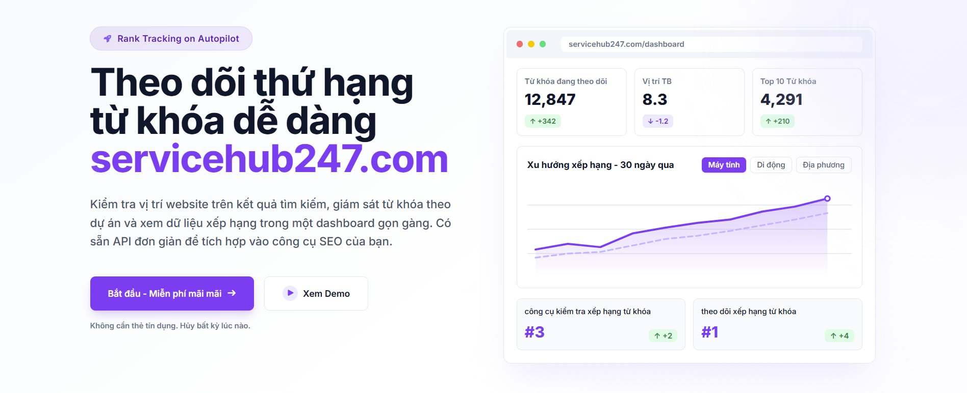
How to read your Keyword Tracking Dashboard
A field guide to every metric on the Servicehub247 dashboard - what each KPI counts, how net change is computed, and how to act on it.
In-depth guides on every KPI, chart, and number on the Servicehub247 dashboard.
A field guide to every metric on the Servicehub247 dashboard - what each KPI counts, how net change is computed, and how to act on it.
Each Overview card counts something different. This guide walks card-by-card - what it counts, the formula, edge cases, and how to react when ▲ or ▼ flips.
Yesterday, This week, Last month, 6 months, Last year, or All time - each answers a different question. Here is when to use which.
Each delta badge under a KPI card is computed as "latest position vs first position inside the window". Here is the exact formula and 5 ways people misread it.
The Visibility chart on each project looks simple but is packed with information. Read the line, the inverted Y-axis, and know when flat is healthy.
Same six KPIs but Overview aggregates the whole workspace while project cards scope to one project. Here is when to trust each.
Open a keyword and you see a timeline, SERP page, ranking URL, and title. Here is what each field means - especially when the ranking URL changes.
Servicehub247 positions often differ from GSC. Not a bug - two systems measure differently. Here is why and which to trust for each decision.