The Dashboard is the operational view of every keyword you're tracking. Each card, badge, and chart answers a specific question - this guide explains exactly what each one measures, how to interpret the delta, and what action it should trigger.
1. Header - Timeframe selector
The timeframe selector in the top-right controls the window every KPI on this page uses to compute the "net change" shown on each card. Switching from Last 24 hours to Last 30 days doesn't change the current counts - only the change badges underneath. Use shorter ranges (24h–7d) to see what just happened, and longer ranges (30d–All time) to see the underlying trend.
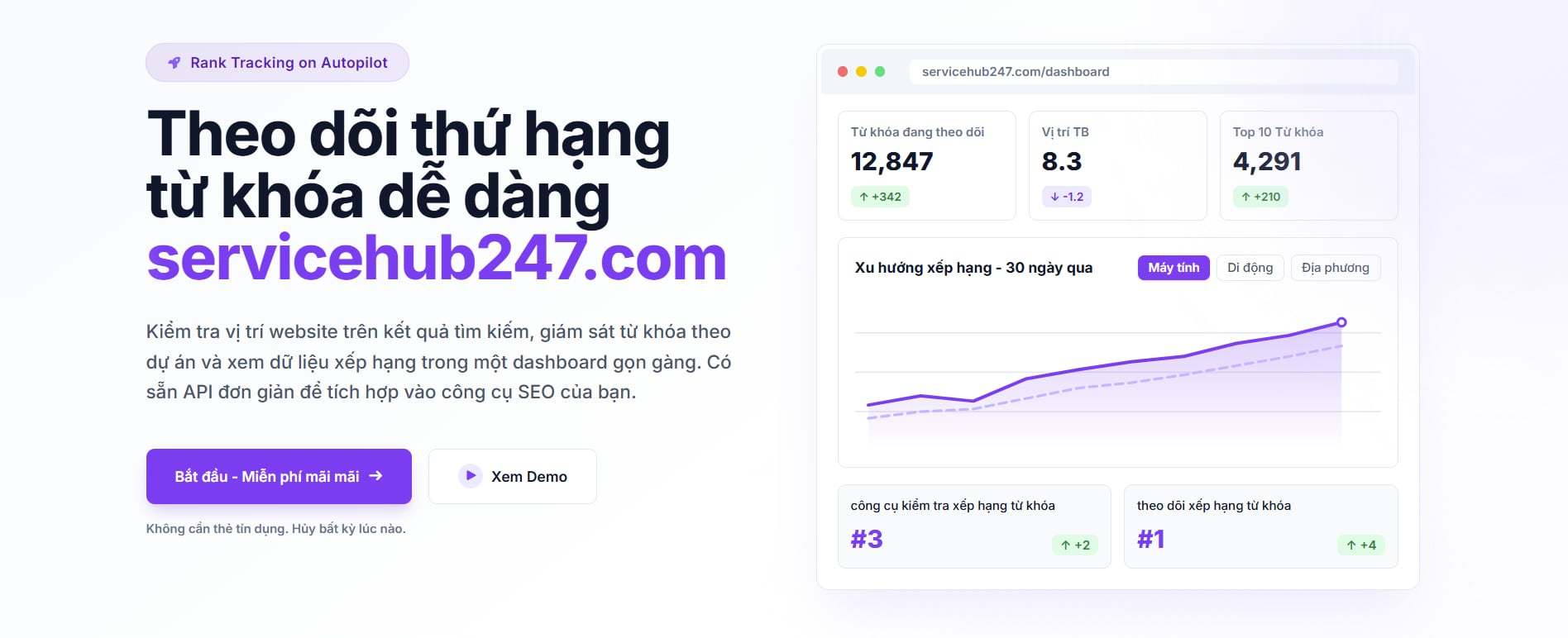
2. Keyword Overview - the six KPI cards
The Overview block aggregates every keyword across all projects in your workspace. Counts come from the latest crawl per keyword inside the selected window. Keywords with no ranking data are excluded.
Keywords Up
What it counts: the number of keywords whose latest ranking is a better position number than the first ranking recorded inside the window.
Net change (▲/▼): (keywords that improved) − (keywords that worsened) over the selected timeframe.
How to act: a rising "Keywords Up" with a green ▲ means your recent SEO work is compounding. If it's red ▼, look at which projects regressed - usually it's an indexability or content quality issue, not a backlink drop.
In Top 3
What it counts: keywords whose latest position is 1–3. These are the positions with the highest organic CTR (typically 25–40%+).
Net change (▲/▼): (keywords that entered top 3) − (keywords that left top 3) inside the window.
How to act: protect Top 3 keywords first. A drop here costs you real traffic immediately - investigate any keyword that just left.
In Top 1 Page (Top 10), Top 2 Pages (Top 20), Top 3 Pages (Top 30)
These count keywords whose latest position is inside positions 1–10 / 1–20 / 1–30 respectively. Anything past page 1 receives a tiny fraction of clicks, but movement toward the top is the leading indicator that page 1 placements are coming.
How to act: Top 20–30 is where most of the achievable wins live in any given quarter. A keyword sitting at position 14 is usually one or two on-page tweaks away from page 1.
In Top 10 Pages (Top 100)
Keywords ranking anywhere in positions 1–100. They don't drive meaningful traffic yet, but Servicehub247 still tracks them so you can see the moment they break into a higher bracket.
3. Project cards - same metrics, one project at a time
Each project card repeats the same six KPIs scoped to that single project, plus a Visibility chart on the right. The card-level deltas are computed exactly the same way as the Overview deltas, just constrained to keywords inside that project.
The Visibility chart
The line plots the daily average ranking position across all of this project's tracked keywords. The Y-axis is reversed - position 1 (best) sits at the top, position 100 (worst) at the bottom. A rising line means your average rank is improving. A flat line during a fresh content push usually means crawl latency, not failure - give it 7–14 days before drawing conclusions.
4. How the deltas are actually computed
For every KPI, the badge under the card is calculated by comparing the latest ranking of each keyword inside the window to the first ranking recorded for that keyword inside the same window. This means:
- A keyword that was added after the window started compares against its earliest data point inside the window - not against zero.
- A keyword with no crawls inside the window is excluded entirely, not counted as 0.
- Switching the timeframe changes the reference point used for the delta but doesn't backfill historical data.
5. Reading the dashboard in five minutes
- Set the timeframe to Last 7 days first - it's the fastest read on whether the recent week was a win or a loss.
- Scan "Keywords Up" across all projects. Green ▲ means momentum, red ▼ means something needs investigation.
- Open the project with the largest red delta, look at the Visibility chart's trajectory, and find which keywords dropped.
- Switch to Last 30 days and re-read the same cards. If a project looks bad on 7d but good on 30d, it's noise; if it's bad on both, it's a real trend.
- Use Top 20 → Top 10 movement as your weekly "what to celebrate" - keywords crossing into Top 10 are the ones that actually change your traffic curve.
6. Common questions
Why does the current count not change when I switch timeframes? The big number on each card is the latest snapshot, so it's the same regardless of window. Only the delta badge underneath responds to the timeframe.
Why is a keyword missing from a bucket I expected? The keyword either has no ranking data inside the window, or it was crawled outside the window. Open the keyword detail to see its raw ranking history.
Why don't my numbers match Google Search Console? GSC averages position across impressions; Servicehub247 reports the actual ranking from a SERP crawl. They will disagree, and that's expected - Servicehub247 is the authoritative number for "where do I actually rank right now."